Click on the image to be redirected to the respective article.
Analyzing Data Bank with DuckDB: Insights and Takeaways

In this article, I solved a Data with Danny case study using DuckDB, a columnar database, within Jupyter Notebooks. I used Pandas for data cleaning and then leveraged DuckDB’s capabilities for OLAP analysis, providing an alternative solution to traditional SQL databases to solve the problem.
I chose DuckDB’s OLAP capabilities over traditional SQL databases for this case study because it offered a more efficient and flexible way to analyze complex data. DuckDB’s columnar storage and in-memory processing enabled faster query performance, making it an ideal choice for handling large datasets and complex queries.
LLM VS LIM: A Comparative Analysis
In this article, I compared Large Language Models (LLM) and Large Image Models (LIM), highlighting their strengths and limitations. I found that LLMs, like GPT-3, excel in understanding and generating human-like text, while LIMs, like DALL-E, can create images from textual descriptions. Both models have unique strengths, such as contextual understanding and visual content generation, but also limitations, including data dependence and specificity. I concluded that the choice between an LLM and a LIM depends on the specific task requirements.

:::
Examining Comedy In India Through EDA Part 1

This article explores the Indian comedy space using the YouTube Data API and performs exploratory data analysis (EDA) on a dataset of popular Indian comedians. I used Python libraries like Pandas and Seaborn to analyze the data and answer questions about the comedians’ YouTube stats. The dataset included features like subscribers, views, and total videos, and the I used this data to compare the performance of different comedians on YouTube.
The analysis reveals that Zakir Khan has the highest subscribers, followed by Abhishek Upmanyu and Anubhav Singh Bassi. Samay Raina has the highest number of videos, but Anubhav Bassi’s quality over quantity approach has led to a high turnover rate. The analysis also highlights the underrepresentation of female comedians in the Indian comedy space, with none of the top comedians being female. This suggests that there is still a long way to go in terms of promoting diversity and inclusion in the Indian comedy industry.
Check out the second part of this article to dive deeper into the analysis and explore more interesting insights about these comedians here.
Through The Lens Of Power BI: How I Met Your Mother
In this article, I brought the popular sitcom ‘How I Met Your Mother’ to life through data analysis. Using a Kaggle dataset, Excel, and Power BI, I created a dynamic dashboard to uncover hidden patterns and insights. My dashboard features key metrics, such as most voted season, highest rated season, and average viewers per episode, as well as graphs and charts that provide a comprehensive analysis of the show.
The key insights from our analysis of How I Met Your Mother reveal that the show consists of 9 seasons, with an impressive average of 9 million viewers per episode. Over the course of its run, the show produced a total of 208 episodes, with the final season (Season 9) being the highest rated of the series.

Through The Lens Of Power BI: Walt Disney Company
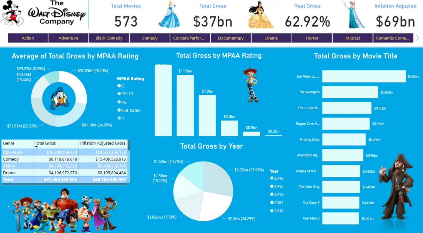
In this article, I created a Power BI dashboard to analyze the Walt Disney Company’s movie data. I used Excel for data preprocessing and PowerPoint to design the background. The dashboard features key metrics, such as total movies, total gross, and inflation-adjusted gross, as well as graphs and charts to visualize the data.
I used DAX formulas to calculate the metrics and arranged them into blocks to create an interactive dashboard. The dashboard provides a comprehensive view of Disney’s movie data, but I believe there’s room for further exploration and improvement, which could lead to new insights and discoveries.
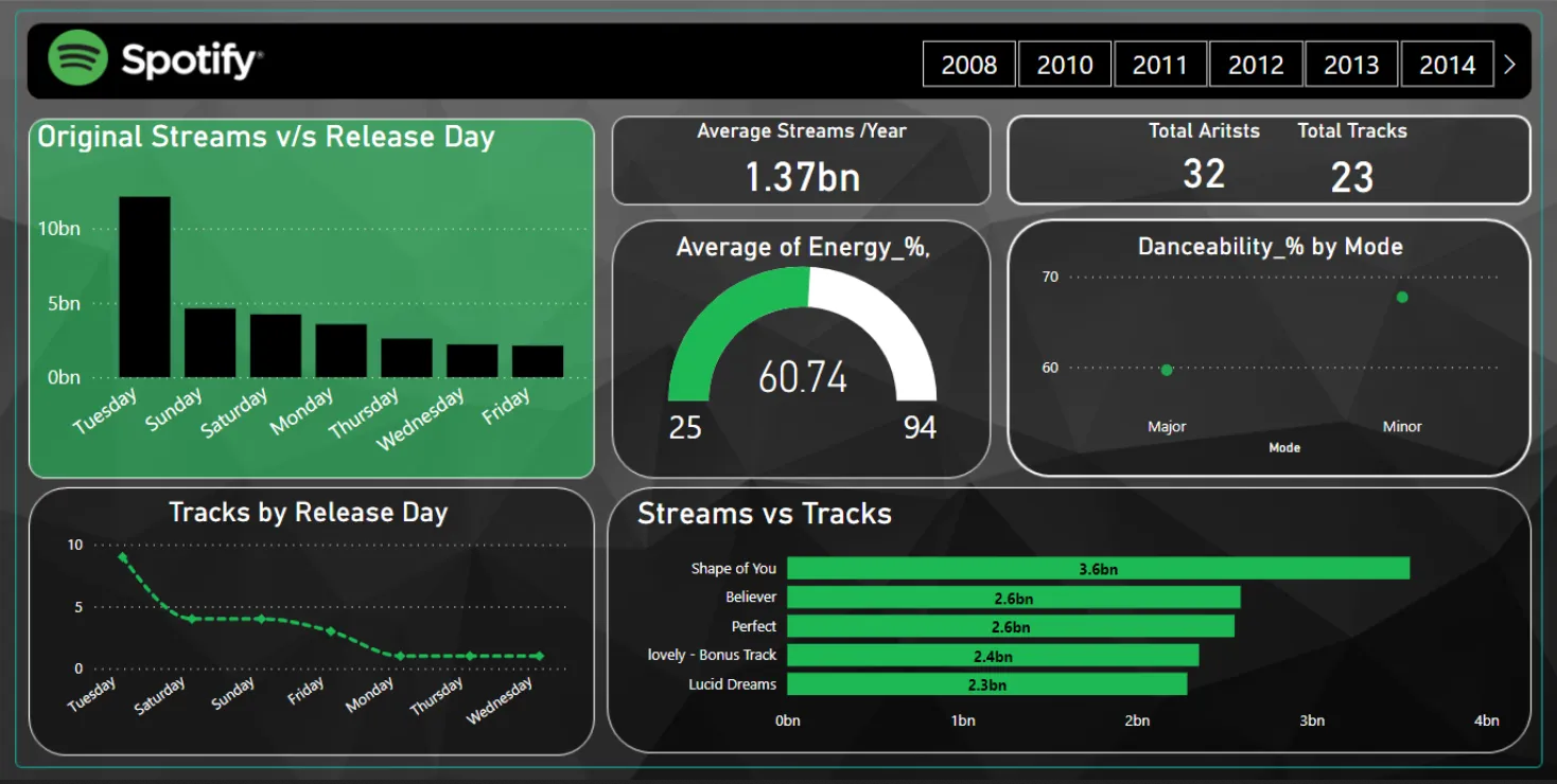
Through The Lens of Power BI: Spotify
I created a Spotify analytics dashboard using Power BI, showcasing various facets of songs streamed on the platform. I preprocessed the data in Excel, removing inconsistencies and null values. I then designed a Spotify-inspired background in PowerPoint and imported it into Power BI. The dashboard features key metrics, graphs, and charts, providing insights into artist and track performance over the years.